
Optimizing Data Filters in
Sigma Workbooks

i
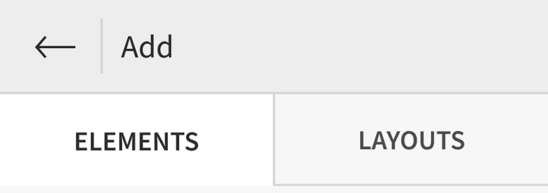
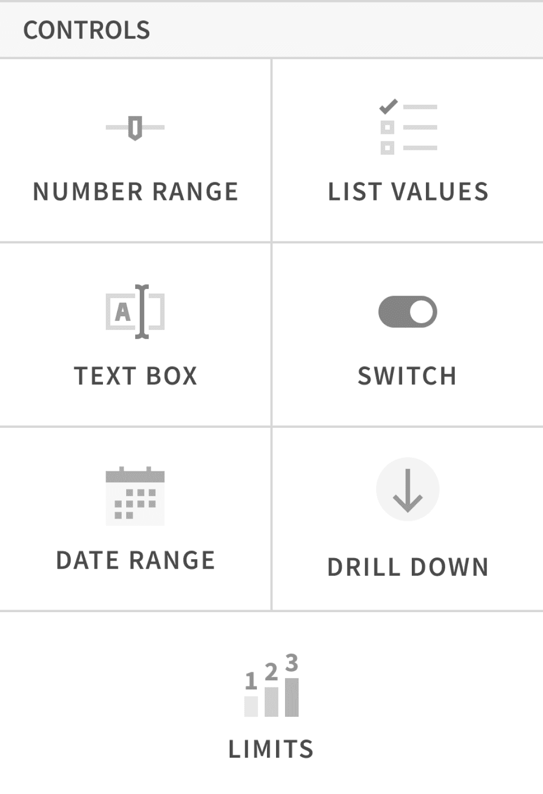
Filters are called Control Elements. The editor panel on the left is used for selecting data and control elements, while the right side features the canvas where all elements are arranged.
Overview
Sigma Workbooks is a cloud-based, spreadsheet-style tool for quick analysis of large datasets, minimizing dependence on analysts or engineers. However, our initial stakeholder meetings revealed a notable issue regarding the data filters within this data analytics platform ......
How might we empower non-technical professionals to analyze complex datasets autonomously?
THE PROBLEM
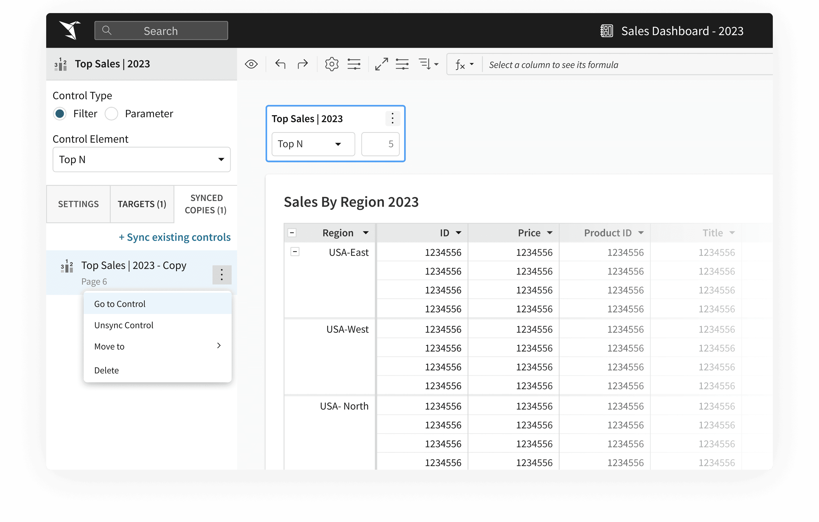
Inability to synchronize original and duplicate control elements
Inconsistent User Flow due to visually identical control elements, exhibiting different behaviors
This problem adds to the confusion in multi-page workbooks, with an abundance of elements
Control Element
Product Type Filter
All
7,00,0000
Music
7,00,0000
Arts
7,00,0000
Mobiles
7,00,0000
PCs
7,00,0000
IT’S DUPLICATE
Product Type Filter
All
7,00,0000
Music
7,00,0000
Arts
7,00,0000
Mobiles
7,00,0000
PCs
7,00,0000

The values selected (in the illustration) in the original control element are not reflected in "it's duplicate" as the two controls aren't linked to or in-sync with each other

CONSISTENT USER FLOW
Streamline controls’ management

Context Switching
Reduce manual control adjustments

FUTURE-PROOFING
Integrate a scalable feature

Small LEARNING CURVE
Minimize learning for new and old users
THE SOLUTION
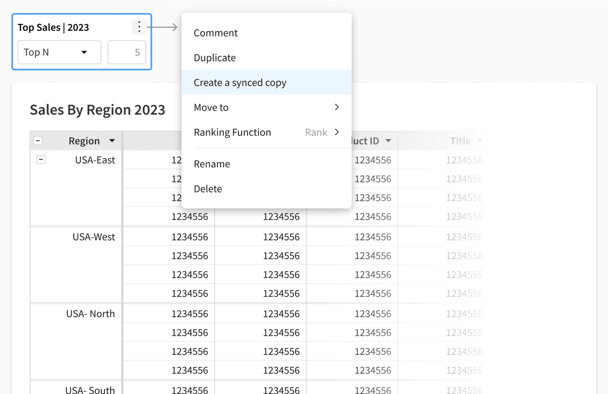
Synchronizing control elements across the workbook

Visually identical control elements with the same behavior ensure consistent user flow
Flexible tracking of these elements and their synced copies globally across the workbook reduces constant context switching
Control Element
Product Type Filter
All
7,00,0000
Music
7,00,0000
Arts
7,00,0000
Mobiles
7,00,0000
PCs
7,00,0000
It's Synced Copy
Product Type Filter
All
7,00,0000
Music
7,00,0000
Arts
7,00,0000
Mobiles
7,00,0000
PCs
7,00,0000

The values selected (in the illustration) in the original control element are automatically replicated across "it's synced copy (or copies)"
480+
New frequent users since its launch in Dec, 2022
240+
Distinct organizations are currently using this feature
~63%
Increase in users’ task efficiency- Beta testing results
Led the design of this high-value feature from research to final design, resolving a long-standing challenge within 4 weeks.
View Demo
But how did I get to the solution.....
KICK-OFF
Interviewed 8 Sales Analysts at Sigma, developing comprehensive workbooks
Later, utilized the insights to map out a user journey, analyzing their usage patterns and challenges.

Jacob
Sales Analyst @ABC_Corp
I create multipage workbook, to make quick informed decisions and showcase yearly sales performance in detail
Jacob
Sales Analyst @ABC_Corp
Hmmm...I’m on Page 7 and seems like I should display the data for West region as well. How should I do that ? #Confused
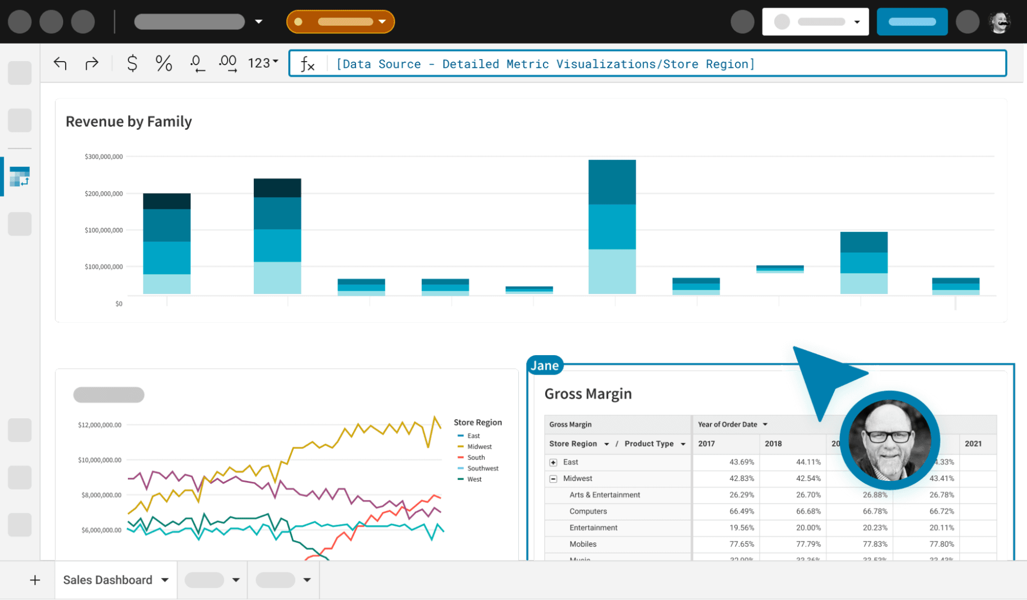
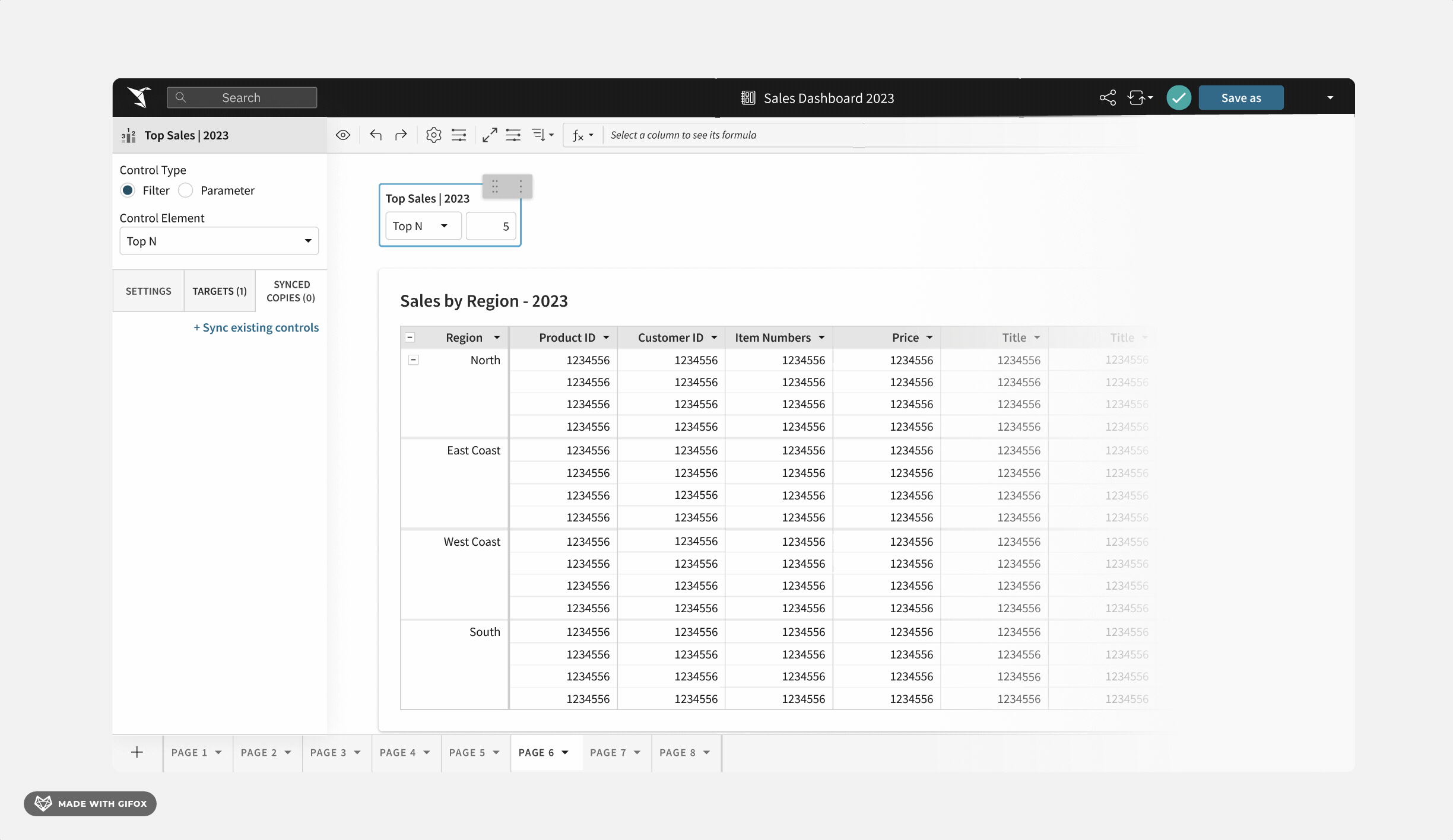
"Store Region" control element (on Page 1) filters data across data elements on "Page 3" and "Page 7"
Sales By Stores 2023
Page 3
2023 Sales By Region
Midwest
East
South
Page 7
Page 1
Store Region
Select Values
All
7,00,0000
Midwest
7,00,0000
East
7,00,0000
South
7,00,0000
West
7,00,0000

3/8
Participants add all their control elements on one page for convenient access

It was advisable to consolidate all controls onto one page for easier modifications across the workbook, yet this practice was not widely implemented.
Frequent context switching had a huge negative impact on users’ productivity. More recall than recognition!
6/8
Participants create duplicate controls on individual pages
However, Duplicates not in sync with original. Hence, changes aren’t reflected across original element
This exacerbates confusion and frustration stemming from inconsistencies in control behaviors between duplicates and originals.
I led a workshop with PMs, front-end, and design teams, using an impact-effort matrix to prioritize opportunities and refine the problem statement.
defining the problem STATEMENT
How might we help users preserve data context without disrupting their flow ?
And voilà, Synced Controls emerged! This feature mirrors changes across all synchronized copies of a control element in the workbook and offers management/ tracking, making data analysis a breeze while maintaining contextual clarity effectively. However, 3 challenges were yet to be addressed….

“ How do we differentiate between duplicate and synced controls ? ”
-STAKEHOLDER

“ How will we manage all synced copies ? We don’t want to break a system that does the job ”
-STAKEHOLDER
DESIGN DECISION 1
How might we enhance feature’s discoverability?
Strategic placement of the feature for maximizing discoverability was crucial. Would users expect it on the canvas or within the editor panel? We found that the optimal placement was within the editor panel.

The canvas, already dense with data and control elements, complicates the user's task of locating and utilizing specific features effectively.

Easy Creation

Enhanced Cognitive Load
Reduced Discoverability

Matches Mental Model
Retains Context
Users familiar with the Editor Panel for management find the feature more readily, aided by its workbook-wide accessibility, minimizing context switching.
Comparing the options : Canvas ( Left) and Editor Panel ( Right )
DESIGN DECISION 2
How might ensure it’s workflow compatibility?
It was essential to craft a user flow aligned with familiar usage patterns.
In the initial iterations, I introduced a 'Controls in Use' section in the 'Add Elements' menu, the initial user interaction point, for improved discoverability. However, this iteration did not resonate with the users' mental model.
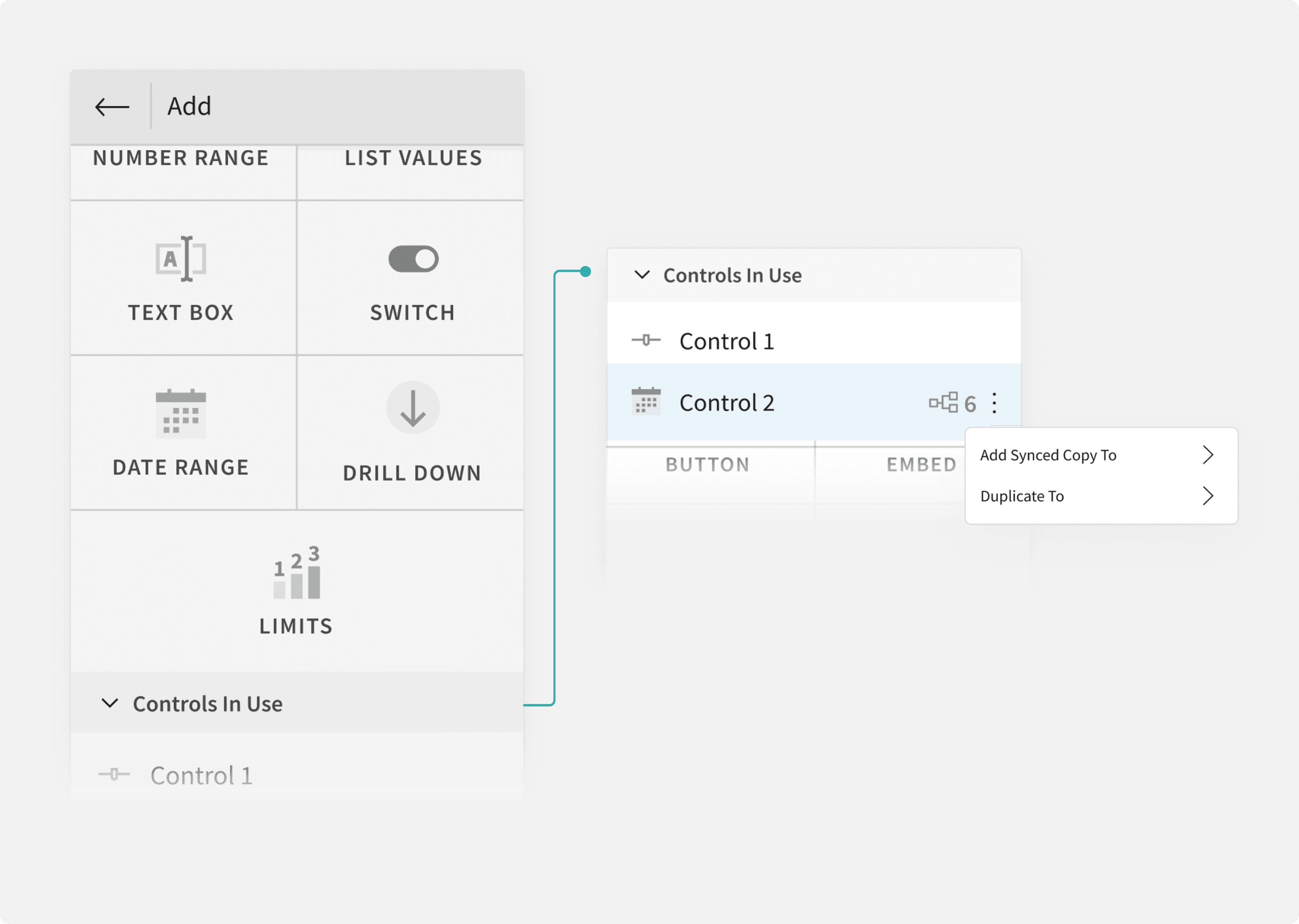
Design Iteration 1 for integrating the feature within the Editor Panel

“ Placing a complex workflow here breaks the purpose of a 1-click add elements menu”
-STAKEHOLDER

“ Why would I first add controls then revisit this menu to create it’s copy? Doesn’t make sense ”
-Analyst, Interview Participant
The feedback highlighted the usual user flow: add control, then set properties
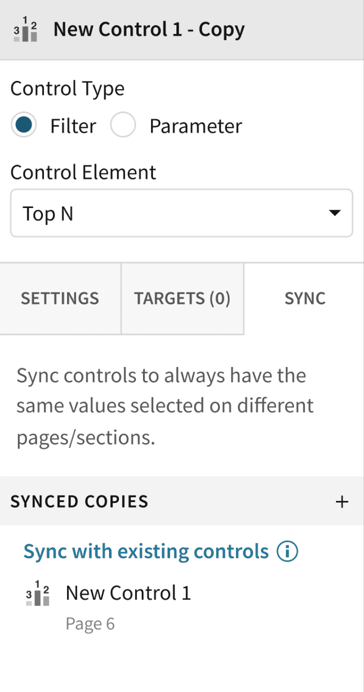
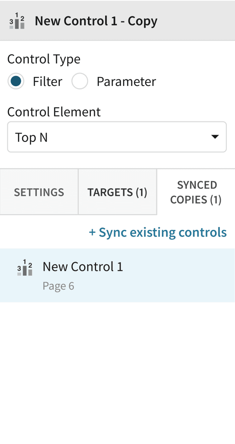
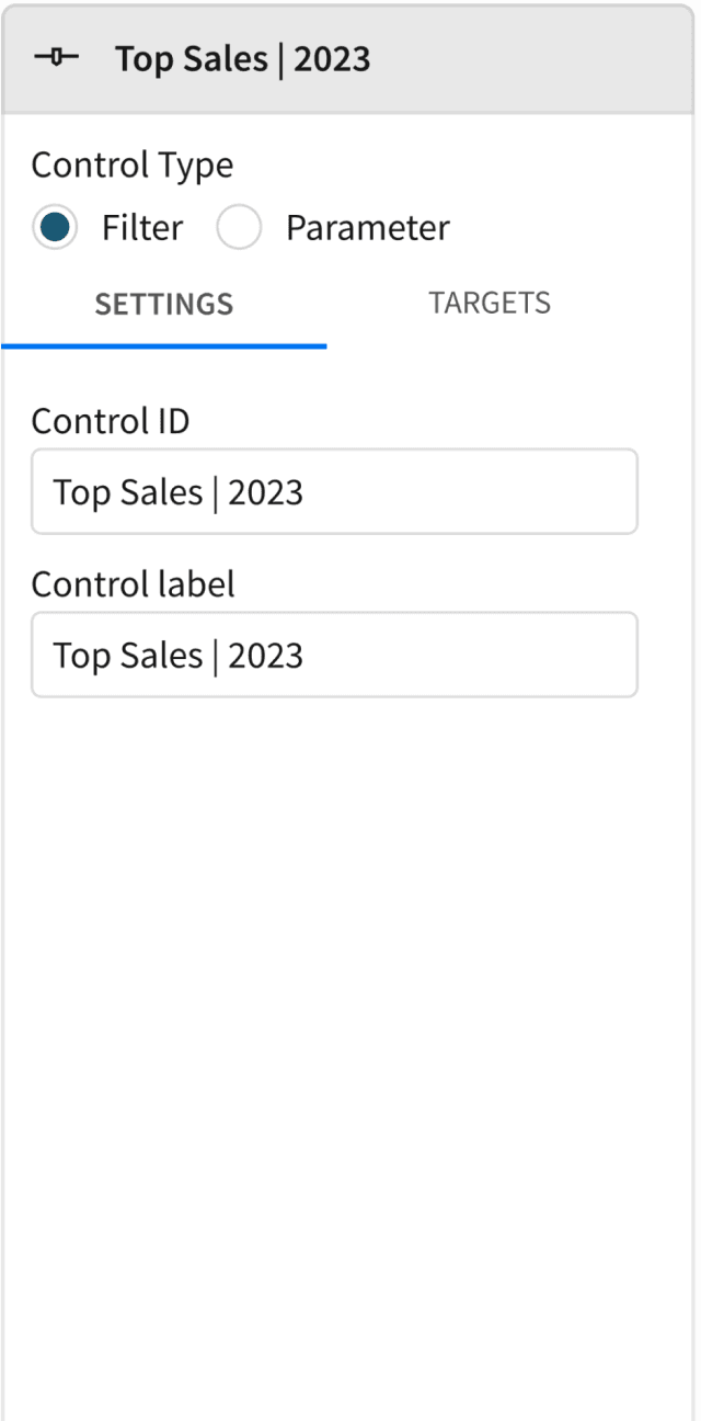
To encourage user adoption, I introduced a "Sync" tab within control element settings. Complements existing workflow, sparks curiosity and prompts users to explore the feature.
01 ADD CONTROL ELEMENT
02 SET TARGET DATA ELEMENT
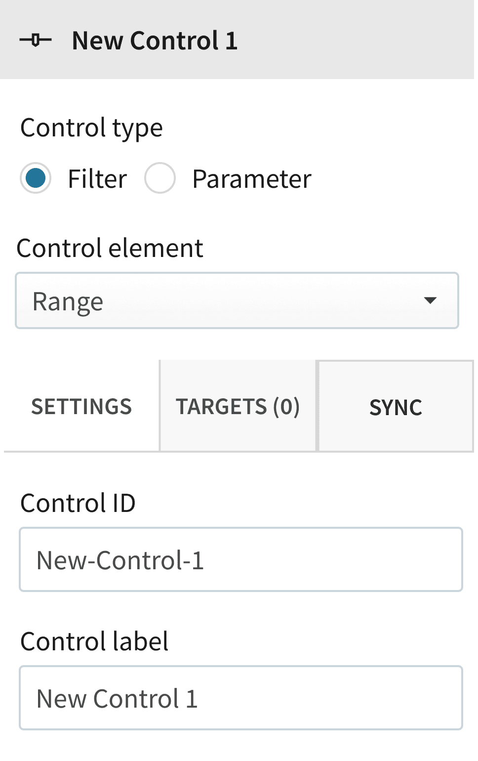
03 CREATE IT’S SYNCED COPY
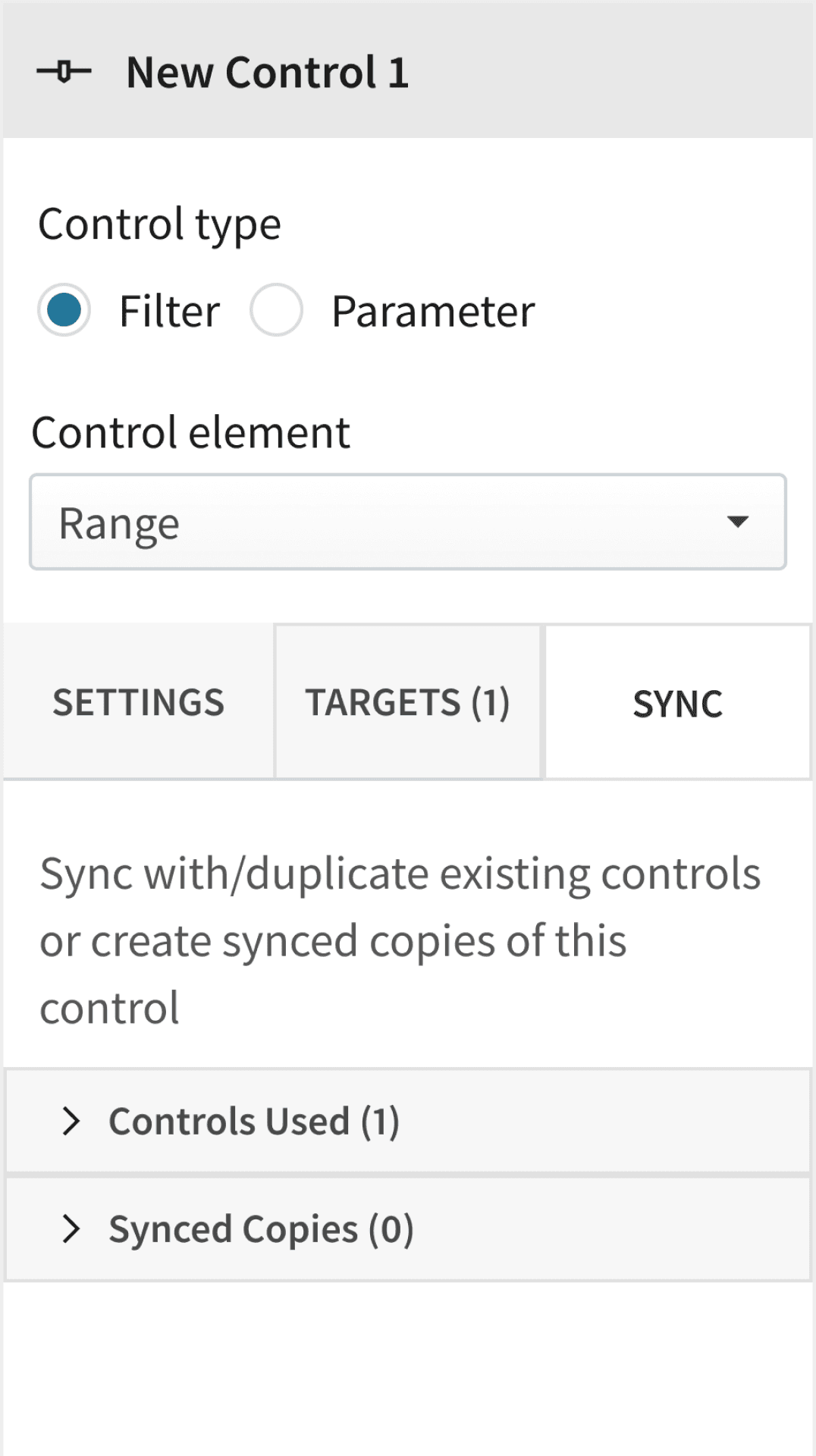
Final design Iteration for integrating the feature within the Editor Panel

“ The first thing I do after adding control is to set targets for it. Hence, I was instantly drawn to the sync tab ! ”
-Analyst, Interview Participant
FINAL CHALLENGE
How might ensure a minimal learning curve?
Our objective here was to convey “More” with “Less”
However, the initial iterations offered excessive guidance, misleading users. The biggest challenge was integrating 3 key functions in limited space of the editor panel.
1
Creating synced copy
2
Tracking all synced copies
3
Flexibility to sync with existing controls
Design Iteration 1 for "Sync" tab's settings

“ This section’s description further confuses me, more than explaining anything ”
-Analyst, Interview Participant

“ What’s the difference between these 2 options ? Why would I ever to “ Sync Controls With ” ? ”
-Analyst, Interview Participant
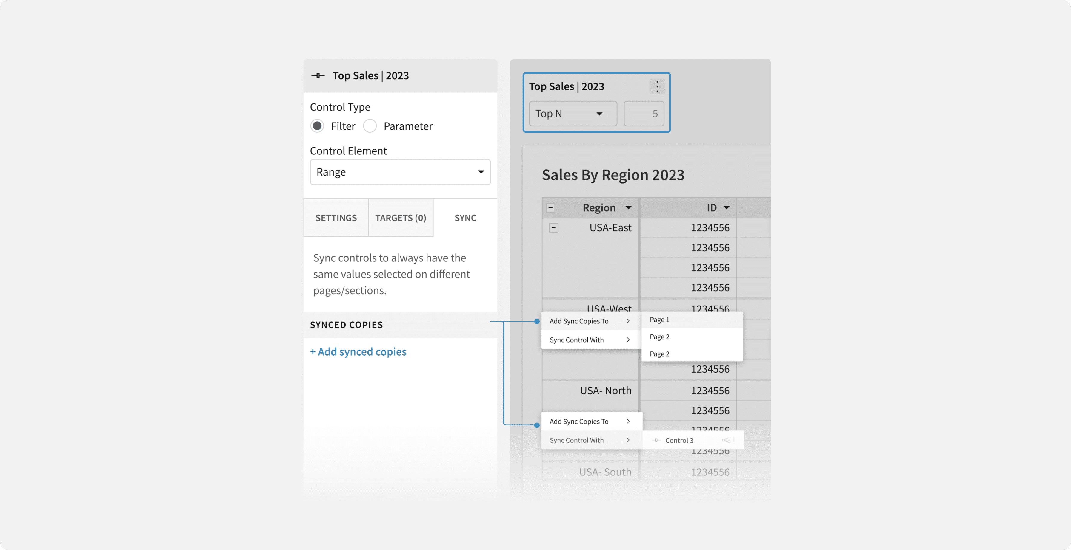
FINAL DESIGN
An intuitive, self-explanatory solution
Synced copies creation is limited to the canvas, as users typically duplicate a control element after navigating to it there.
Option to move synced copies to another page appears only after their creation, prevents them from getting obscured by elements on a new page.
Limiting core actions to 4, appearing on-demand, reducing cognitive overload, easing decision-making
Placing one clear call-to-action, functionally distinct from other editor panel actions

A scalable feature integration
PREVIOUS ITERATIONS
FINAL DESIGN
EXSITING CONTROL SETTINGS

High feature discoverability
Reduced cognitive load
Effective placement of CTAs for an intuitive experience
Clear & Concise labelling . Thanks to the collaborative brainstorming sessions with the UX writing team
OUTCOME
Game-changer
for Sigma
During my summer internship, I tackled this longstanding challenge with an emphasis on sustaining vital customer relationships. My role spanned from research to design, thorough documentation for hand-off, and engaging stakeholders in ideation workshops.
The design, launched in December 2022, garnered remarkable results. It attracted over 480 new users and is now employed by more than 240 organizations, boosting users’ task efficiency by ~63%, marking a pivotal accomplishment in my journey as an impact-driven product designer.
100% usability testing participants found the feature's flow intuitive and easy to follow.
Some participants suggested reducing the editor panel's actions to 2 : for locating and un-syncing the selected control.
Few participants found the use of technical jargons such as “sync”, confusing!

Let’s Connect
samika.rast136@gmail.com