Presenting Optmyzr as a Cohesive Tool
i
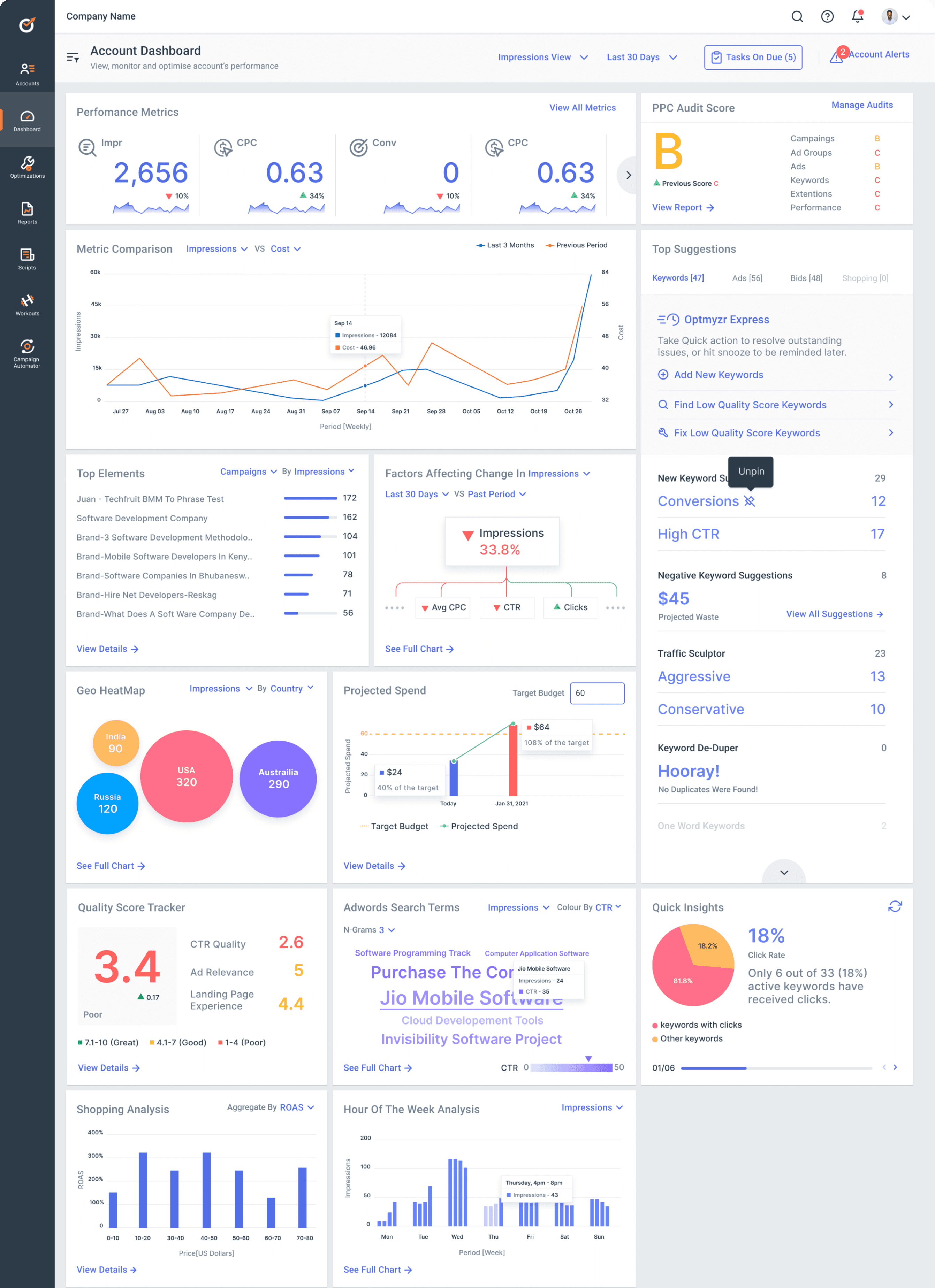
The account dashboard offers a quick, customized overview of account-related data and tools, for efficient monitoring and management.

Overview
Optmyzr, an AI-powered tool, empowers marketers to boost online ad performance with detailed insights and tailored optimization strategies for ad campaigns of any type. Despite its significant capabilities, it was yet to fully realize its potential ....
How might we empower marketers with Optmyzr's robust tools to maximize their campaigns' effectiveness?
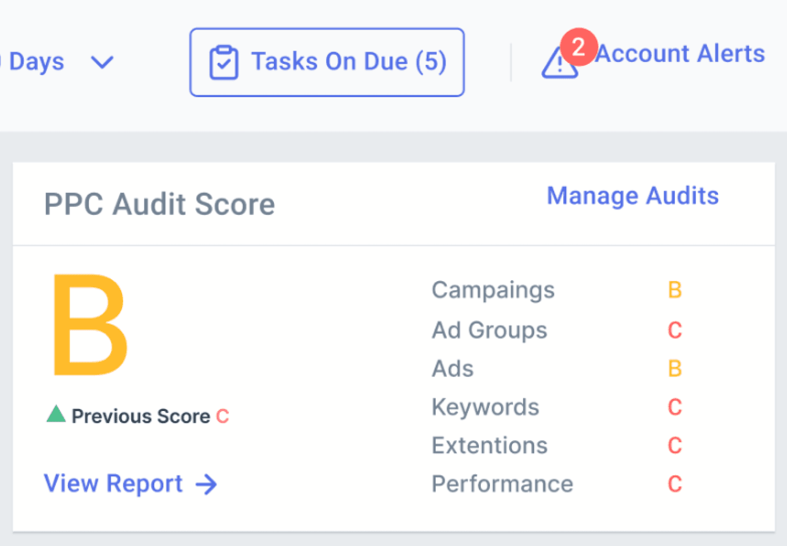
The PROBLEM
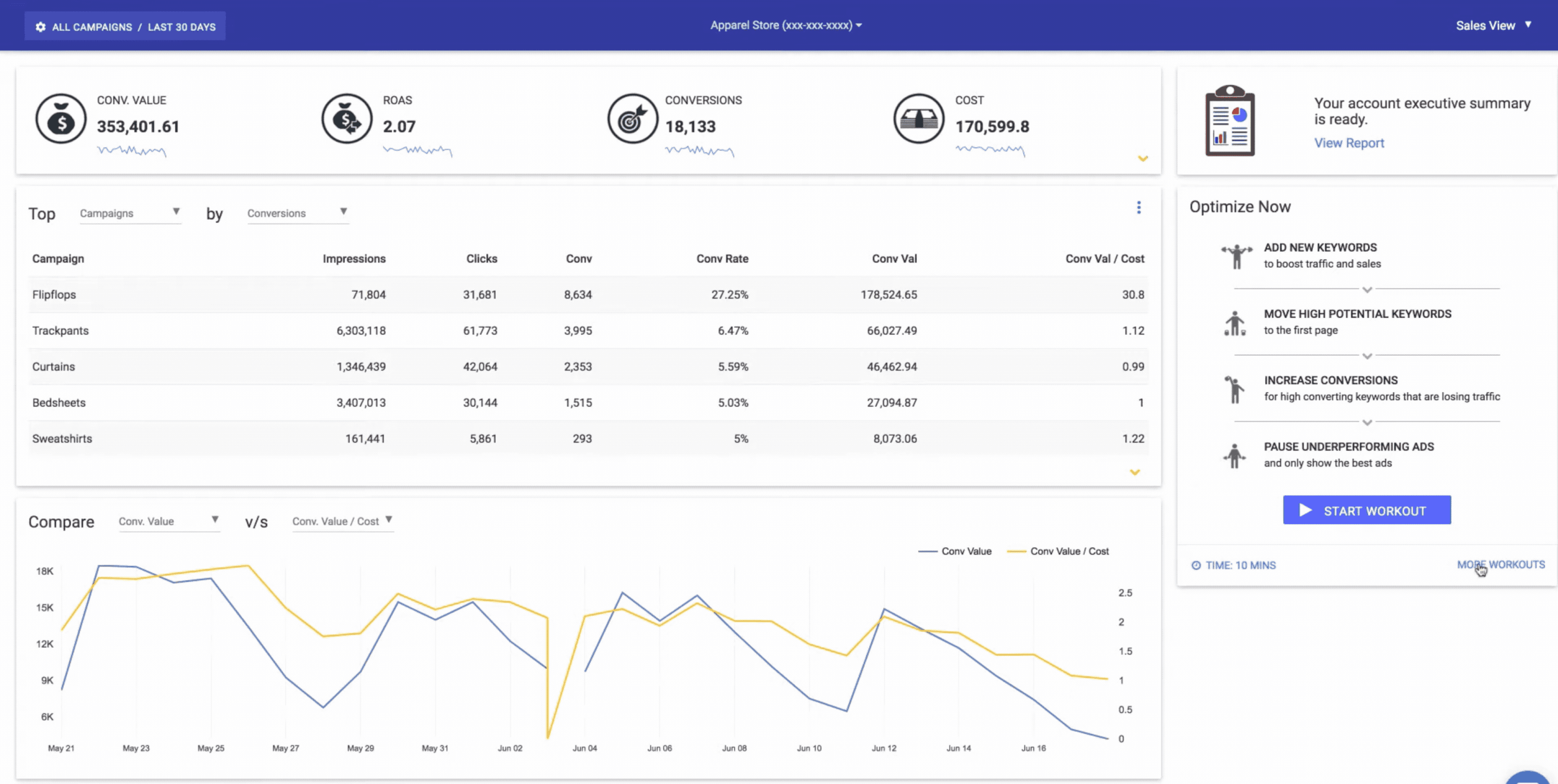
Low discoverability of Optmyzr’s most valuable tools
Insight and optimization tools were accessible only through long, jargon-heavy drop-down menus, hindering ease of access and comprehension.
Fully grasping each tool required visiting tools’ pages, leading to extensive back-and-forth navigation and workflow disruption.
Insights
Optimizations
Dashboard
Insights
Alerts (4)
Covid-19 PPC Analysis
PPC Policy and Audits
PPC Investigator
Search Terms N-grams
Shopping Analysis
Quality Score Tracker
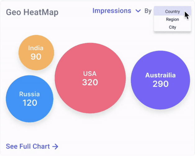
Geo Heatmap
Spend Projection
Hour of Week Analysis
Landing Page Analysis
Performance Comparison
For Keywords
For Manual Bidding
For Automated Bidding
For Ads
For Budgets
For Placements
For Campaigns
Optmyzr Express
Rule Engine
Utility Tools
Automation Settings
Expanded dropdown menus for accessing Insight and Optimization tools are available in the user's signed-in account.

Small LEARNING CURVE
Educate users about diverse tool suite

FUTURE-PROOFING
Present Optmyzr as an integrated solution

COMPREHENSIVE VIEW
Offer a snapshot view of an account
The SOLUTION
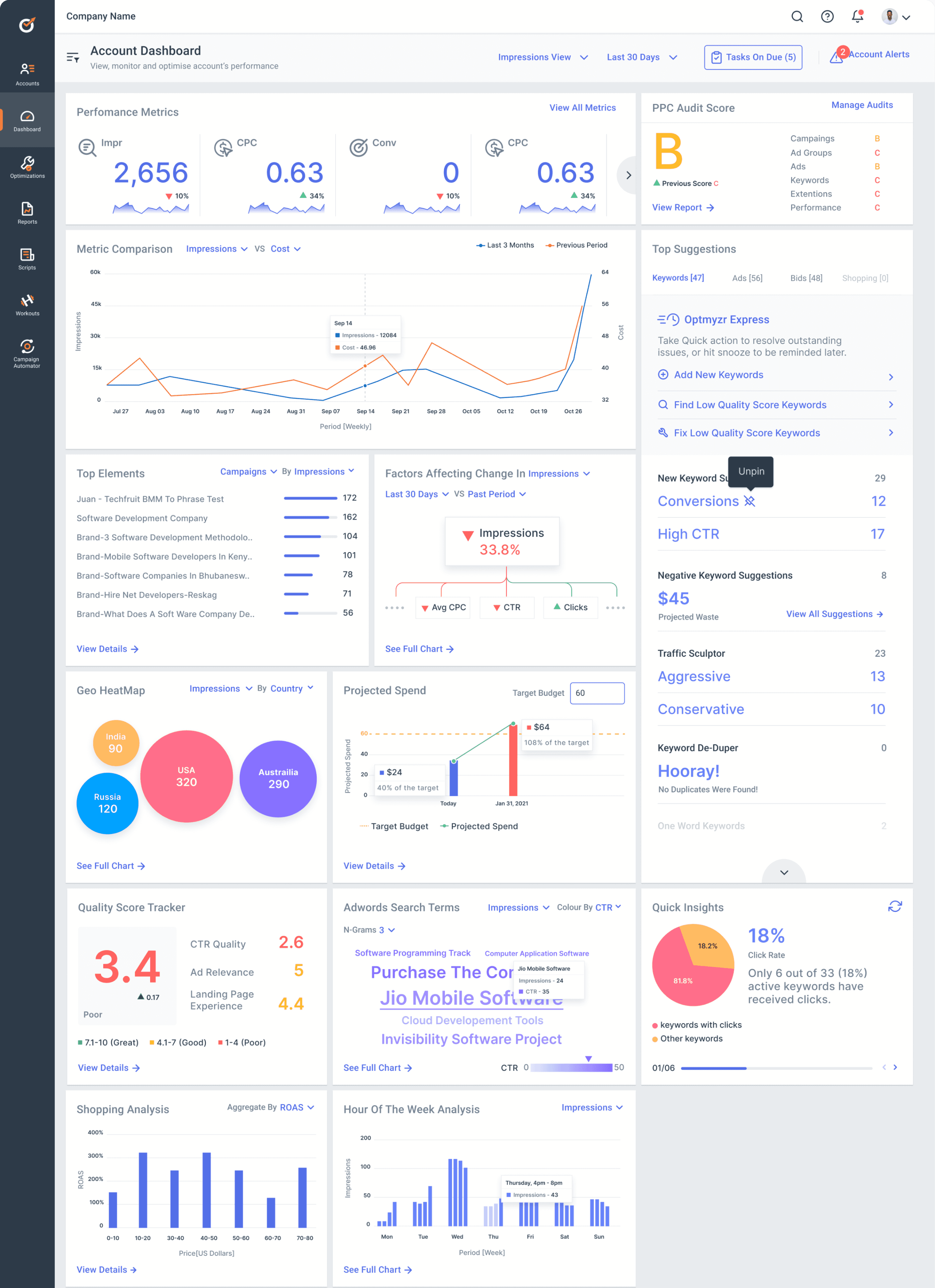
Account Dashboard: One-Stop Solution for Users' Every Need!
Adding new data visualizations to the account dashboard, representing all tools concealed within extended drop-downs

Educates users about each tool’s functions
Encourages them to explore comprehensive tools
Presents Optmyzr as a unified tool suite
Insights
Insights
Alerts (4)
Covid-19 PPC Analysis
PPC Policy and Audits
PPC Investigator
Search Terms N-grams
Shopping Analysis
Quality Score Tracker
Geo Heatmap
Spend Projection
Hour of Week Analysis
Landing Page Analysis
Performance Comparison
Optimizations
For Keywords
For Manual Bidding
For Automated Bidding
For Ads
For Budgets
For Placements
For Campaigns
Optmyzr Express
Rule Engine
Utility Tools
Automation Settings
The tools listed in the drop-down menu have been translated into data visualizations, presented in the re-designed account dashboard
200+
New frequent users since its launch in Aug, 2021
~ 28%
Reduction in customer support queries

“ The ultimate fix! Everything our users need at a glance. ”
- Frederick Vallaeys , Optmyzr’s CEO
Led Optmyzr's project at a design agency, developing data visualizations with a UI designer. Collaborated with Optmyzr's team, advocating designs and driving the project vision.
However, finding the solution wasn’t a straightforward task ...
KICK-OFF
Evaluating the gaps between users’ needs and the product
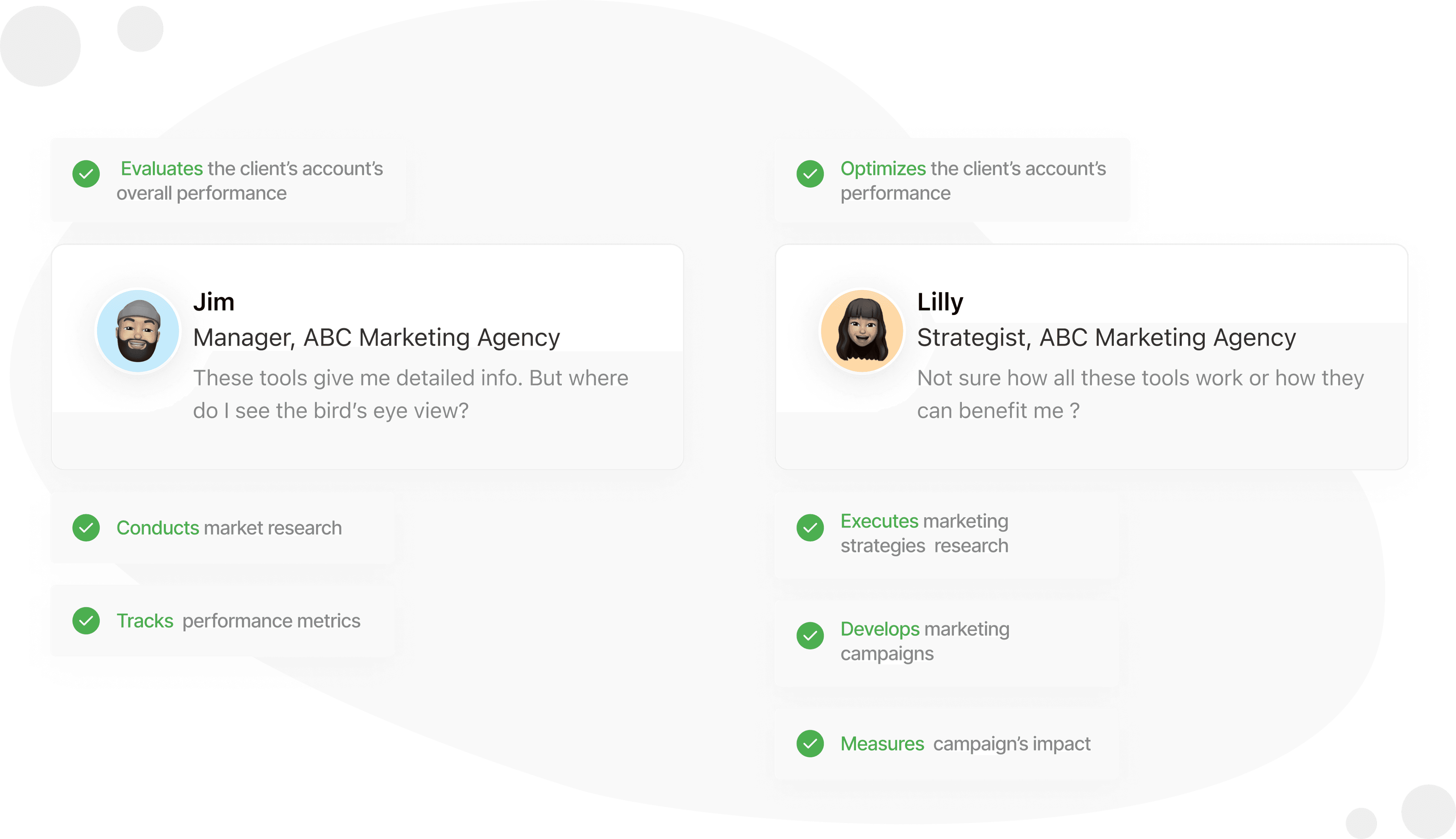
An initial meeting with Optmyzr's CEO, 2 PMs, and 3 developers offered key insights for developing 2 user personas.
01
There was a clear necessity to ensure easy and quick access to all tools

Optmyzr Express and Quick Insights widgets, were the most popular on the existing dashboard
The absence of a comprehensive dashboard forced users to switch between tools' pages to compile overall account performance insights.
02
Users lacked the drive to explore a wide array of tools !
Optimization tools, despite being Optmyzr's USP for maximizing ad campaign performance, exhibited the lowest user engagement.
New users faced a steep learning curve with Optmyzr, seeing it as a complex tool with too many features they didn't grasp, resulting in low adoption.
After uncovering 2 key opportunities, the real problem became apparent.……
defining the problem STATEMENT
How might we introduce effective entry points for all tools ?
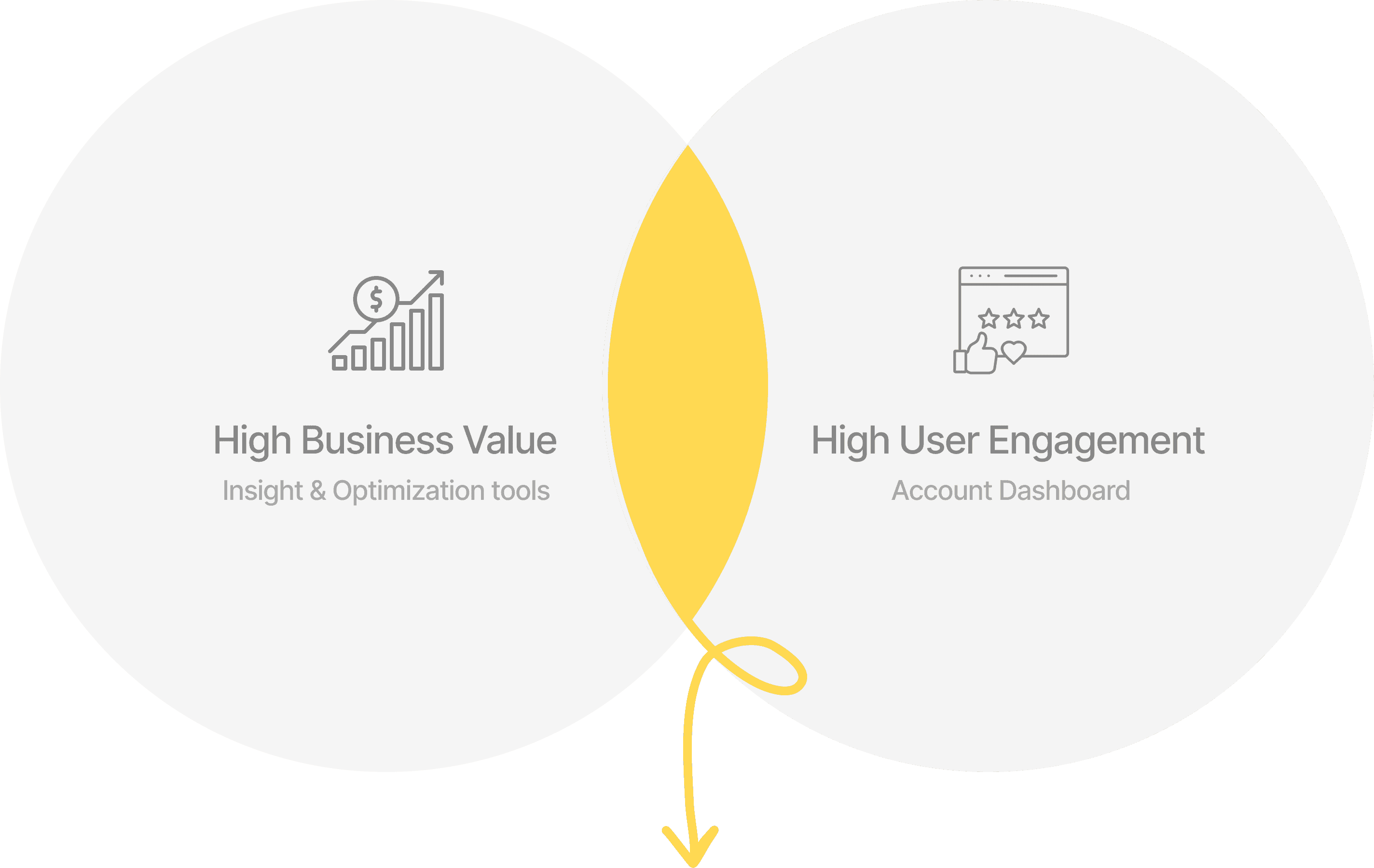
Objective : To minimize the dependency on dropdown menu for accessing tools within Optmyzr, balancing business value with strong user engagement.
💡 How about we integrate all the tools onto the dashboard?
The challenge : Incorporating 50+ tools into the dashboard's limited space. My approach? 2 strategic design decisions.
DESIGN DECISION 1
Defining the dashboard’s layout
My objective was to tailor the layout to accommodate the needs of all user personas
Initially, I emphasized the dashboard's core function of offering insights, integrating only insight tools. However, this limited scope failed to meet the broader needs of the platform’s diverse user base.


“ Providing insights works for managers, not so much for strategists relying on optimization tools ”
-STAKEHOLDER
For defining a layout to suit all users’ personas, I implemented a three-step process
STEP 1
Effective categorization of all tools
My objective was to tailor the layout to accommodate the needs of all user personas
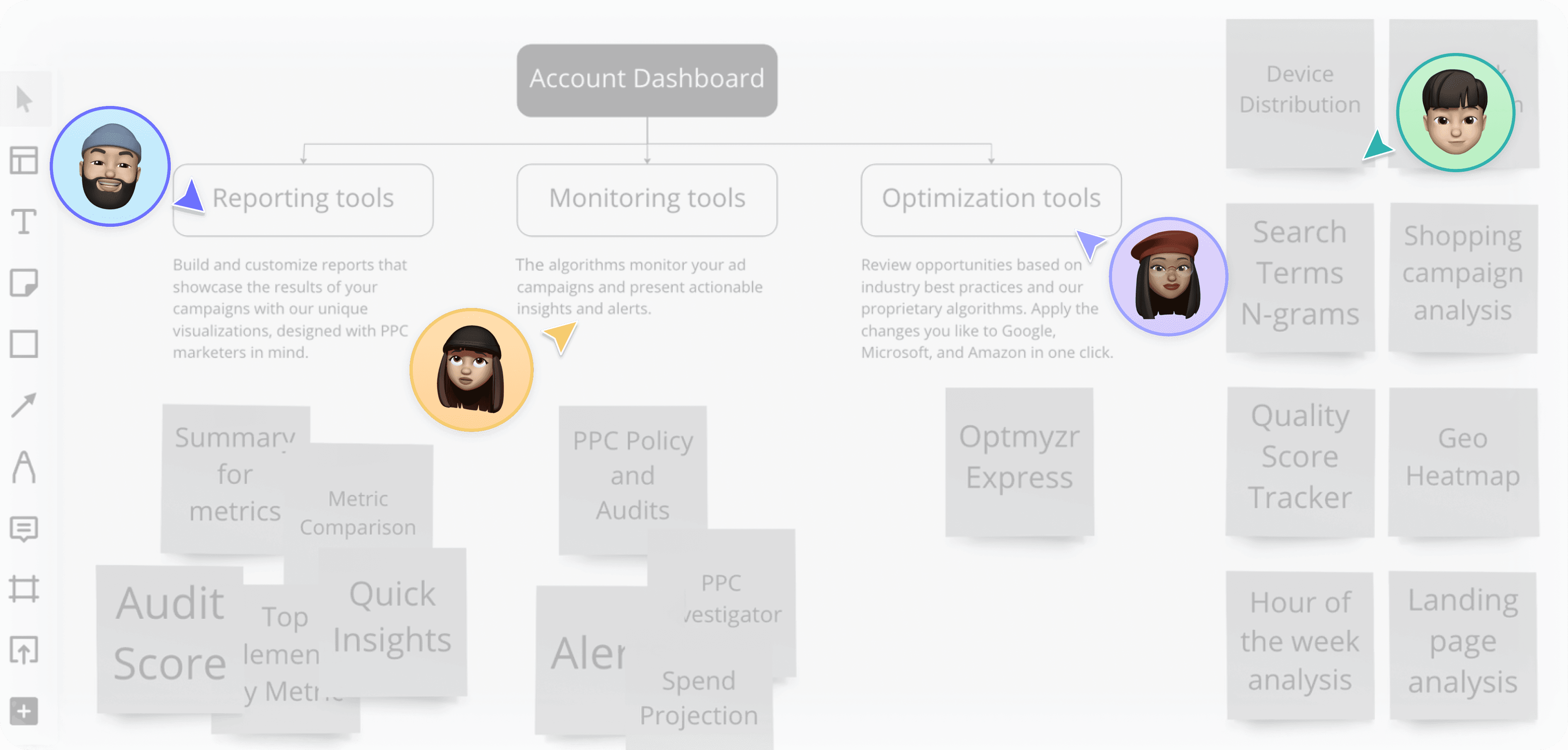
Tools lacked suitable categorization. I conducted a card-sorting workshop with stakeholders to segment tools into appropriate categories based on their function, thereby restructuring the information architecture.
Card-Sorting Workshop
Existing IA
Account Dashboard
Insight Tools
Optimization Tools
Restructured IA
Account Dashboard
Monitoring Tools
Insight Tools
Optimization Tools
STEP 2
Mapping the defined categories to distinct personas for determining their priority

STEP 3
Most used tools such as insight/reporting and optimization tools were assigned a higher priority
80%
of the total width of the grid dedicated to the Insight Tools as they required a wider area for representation

High Priority
85%
Use Insight Tools


20%
of the total width is dedicated to the Optmization Tools
High Priority
100%
Use Optimization Tools

Moderate Priority
50%
Use Monitoring Tools
85% of the total real estate of the dashboard is dedicated to the High Priority tools
15% of the real estate is dedicated to lower priority tools appearing “on-demand”
However, allocating different priorities to various tool categories didn't yield favorable results 😕

“ These iterations are convenient for some but require a long scroll for other users ! ”
-STAKEHOLDER
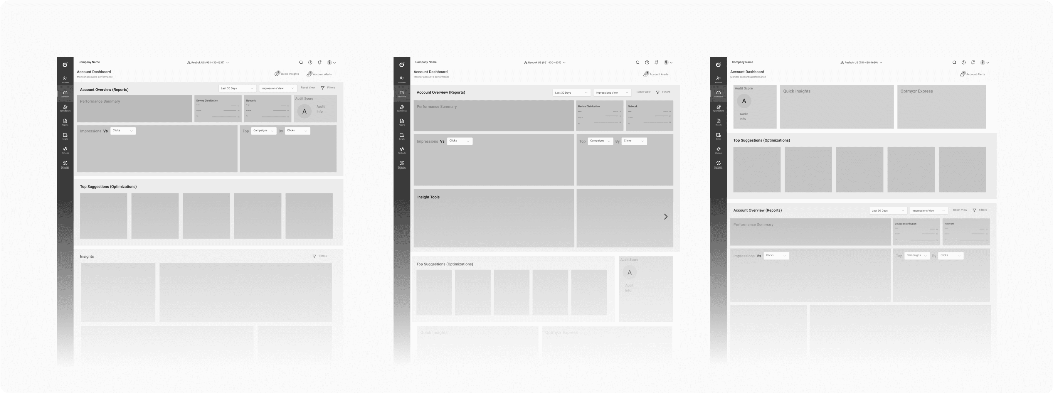
Final outcome? Equally prioritizing tools by placing them at the same horizontal level
Final grid layout for the re-designed account dashboard

2 parallel sections ensuring equal priority for all tools
Dedicated space for all categories, increased find-ability
DESIGN DECISION 2
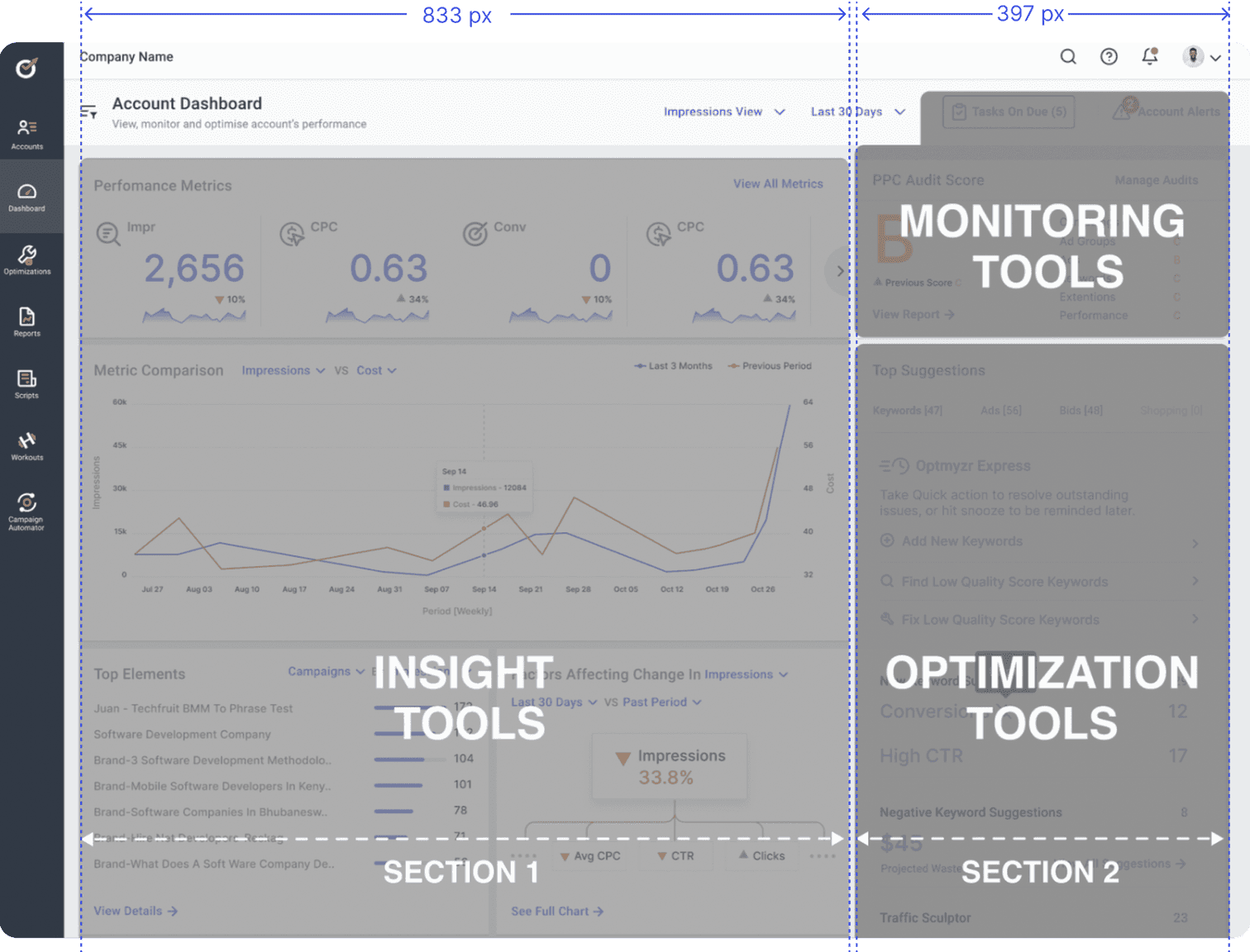
Designing widgets for a concise tool overview
The aim was to design interactive data visualisations to educate and inspire users to delve deeper
Our goal: Prioritize essential information to reduce cognitive load, yet initial iterations had too much text, lacked engagement, and left users uncertain about widget actions.
Clicks
185
-33.88%
Clicks
185
-33.88%
Clicks
185
-33.88%
Clicks
0
-33.88%
Clicks
185
-33.88%
Clicks
185
-33.88%
Clicks
0
-33.88%
Clicks
185
-33.88%
Clicks
185
-33.88%
Clicks
185
-33.88%
Clicks
185
-33.88%
Clicks
185
-33.88%
Clicks
185
-33.88%
Clicks
0
-33.88%
An Insight tool's full chart , as displayed on the tool's specific page
See More
Why did Impressions change during the
Last 30 days compared to the Previous Period ?
Cost
Search Lost Is ( Rank )
Seach Lost Is (Budget)
Display Lost Is (Rank)
Inf % / 864.4
2,910% / 394,916
1,600% / $1,383.87
1,291% / 1,110
Design Iteration 1 of the tool's widget for dashboard

“ Text- Heavy! I got lost in the details. Seems too complex to be explored ”
-STAKEHOLDER
Hence, I opted for engaging Data Visualizations over compressed charts for quick grasp at a glance.
Impressions
185
-33.88%
Clicks
185
-33.88%
Clicks
185
-33.88%
Clicks
185
-33.88%
Clicks
185
-33.88%
Clicks
0
-33.88%
Avg CPC
185
-33.88%
CTR
185
-33.88%
Clicks
185
-33.88%
Clicks
185
-33.88%
Clicks
185
-33.88%
Clicks
185
-33.88%
Clicks
185
-33.88%
Clicks
0
-33.88%
Impressions
33.8%
Avg CPC
CTR
Clicks
Factors Affecting Change in
Last 30 Days
VS
Past Period
See full chart
Impressions
High-level overview encouraging exploration of comprehensive tools
Swapping technical jargon with effortlessly graspable language
Highlighting actions linked to each widget with clear labels

“ Very interesting and very well indicate the high and low points in one go”
-STAKEHOLDER


“I love the depth of information they provide. Gives a glimpse but makes me curious about the big picture”
-STAKEHOLDER

“ These visualisations would be a game-changer for us ! Definitely a one-stop shop ! ”
-STAKEHOLDER
And finally 🥁, resolving the biggest challenge of accomadating 30+ Optimization tools within 20% of the space
Despite being core to Optmyzr's value, Optimization Tools faced low engagement rates, highlighting the need for attention.
Acknowledging the space challenge, I introduced the "Top Suggestions" widget, encapsulating all Optimization Tools, providing a personalized view instead of a compressed one.
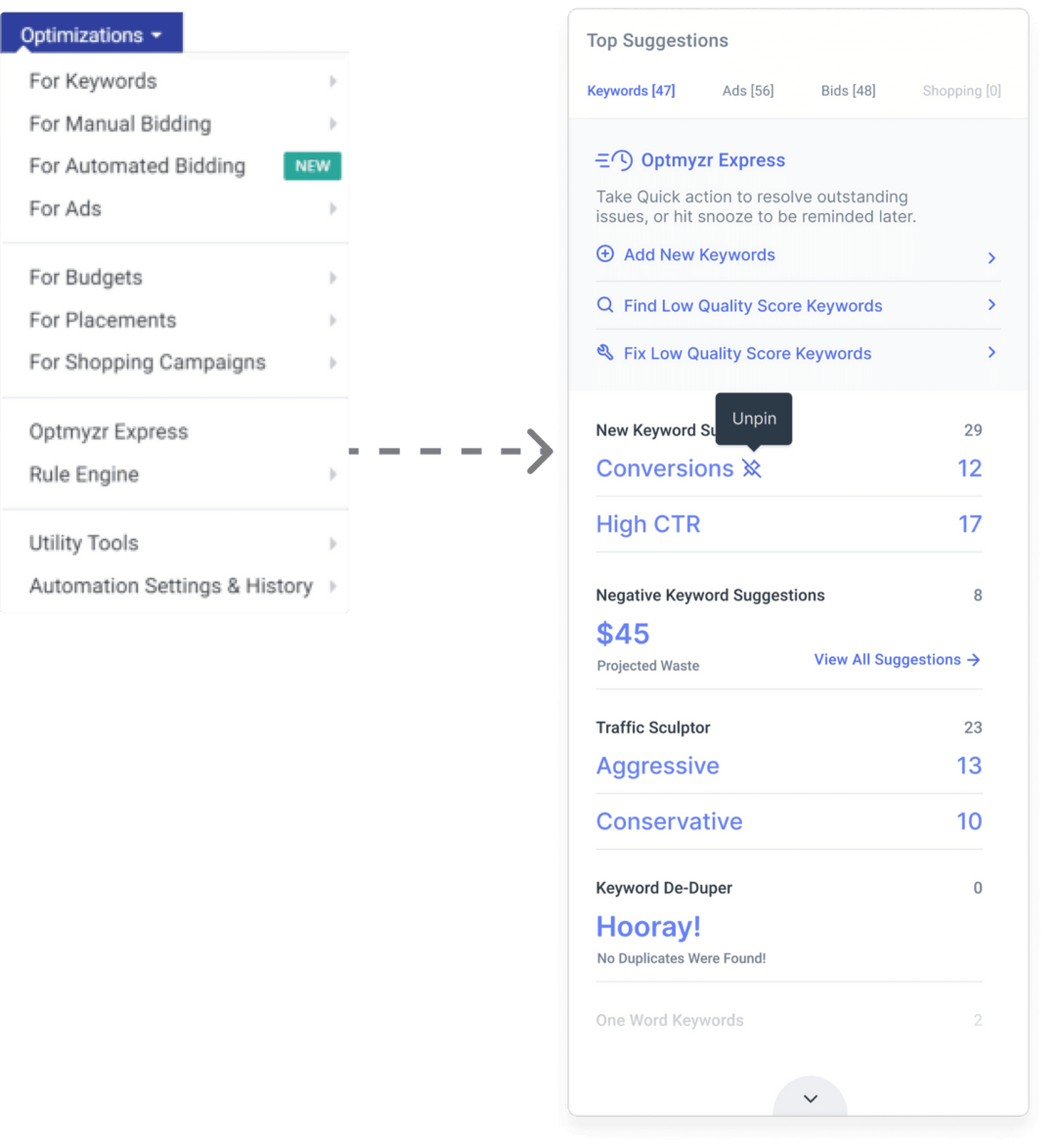
Enhanced Discoverability : Distinct tabs for each optimization tools’ category
Quick Access : Displays Optimization Tools pinned for a specific account at the top
Features Optmyzr Express since it was the most popular widget previously
Low cognitive load - only displays active suggestions from most suitable tools for an account
FINAL DESIGN
The Ultimate Toolbox: An All-in-One Solution
A captivating snapshot aimed at educating users, motivating them to delve deeper, and showcasing Optmyzr as a cohesive suite of tools! ✨
Solution
Effective positioning and prioritisation of tools
Personalized Preview with widget specific filters

Added flexibility with global filters
OUTCOME
Engagement
soars
While my primary focus was on the initial stages, the team continued refining the concept before the 2021 launch, resulting in over 200 users. The 28% reduction in customer support queries highlights improved user autonomy, while the 83% increase in tool discoverability signifies significant progress.
Moreover, this success motivated the Optmyzr team to renew their commitment to enhancing the product's intuitiveness. However, due to constraints in time and budget, comprehensive qualitative research was not feasible. Nevertheless, we proposed working towards achieving our ultimate goal of creating customizable dashboards for all users in the future.
The Jobs-to-be-Done framework empowered us to shape a compelling narrative for Optmyzr throughout through data visualizations
Realized the crucial importance of intutive information design meeting user and business needs
Successfully advocated for users while balancing developer, PMs' priorities, collaborating to gain deeper insights into user needs.

Let’s Connect
samika.rast136@gmail.com